Ah, back to reality!
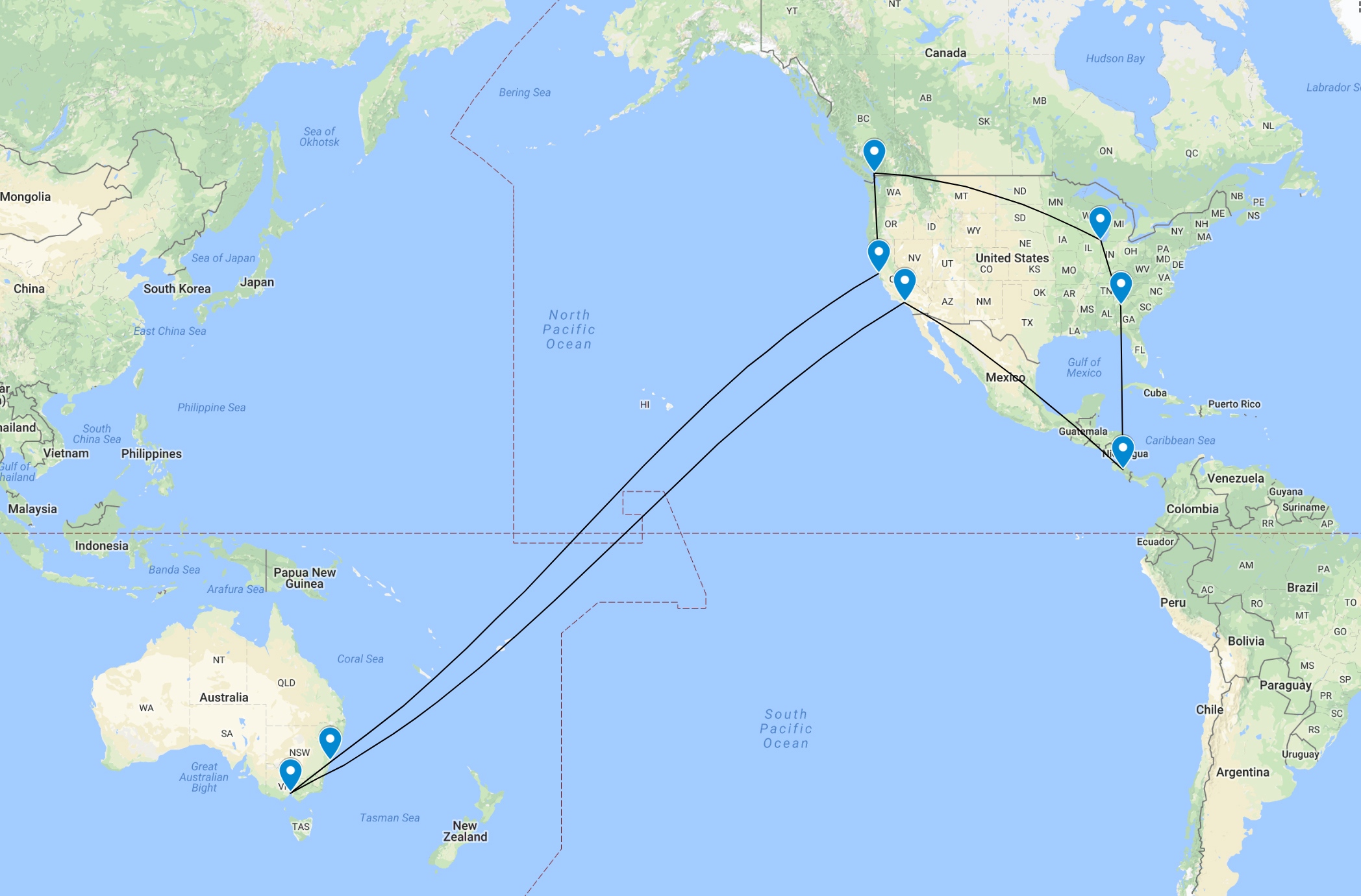
Last month, I was fortunate enough to be able to travel away from the cold Sydney winter over to Central and North America for a holiday and also to present my work on multiDA at JSM in Vancouver. Whilst at JSM, I was able to hear Earo present her work (along with Di and Rob) on making calendar plots in R, using data from pedestrian traffic in Melbourne (see more here). I was super impressed by my work, and on my flight home I realised I could also have a crack at using the package by analysing my own step count data. I felt like I had walked a lot more whilst I was travelling - would the visualisation agree?

Step count visualisation from my iPhone with sugrrants
1) Export data off the iPhone
I use the QS Access App to export data from Apple Health into an easy to load .csv format for analysis. If you have a Samsung like I did before (you’ll be able to notice on the resultant calendar plot the day and time I switched over), it is much more difficult to export data from Samsung health. I had planned to combine that data with my iPhone data to no avail, the steps are long and require you to download old SDK’s from github and enable developer mode (see more here). In the end, the data I managed to get off completely struck off the date component, and it seemed like my Samsung was counting fake steps when I was sleeping every night at around 3-4am. Rubbish data.

Onwards and upwards with the iPhone data!
2) Some data cleaning
Before we go any further, we are going to have to load some libraries into R. To save time, you could simply load the tidyverse package for all requirements to be loaded. Specifically, we will be using the dplyr and lubridate packages for this step. You will also need the magrittr package for the pipe function (optional).
The steps_export.csv file contains three variables - the start date time for when data was collected, the finish date time, and the number of steps in that period. The data is grouped by the hour, which is very handy. We first rename the column names for ease of analysis, and use the lubridate package to convert our date into something sensible that R can understand (it is initially read in as a factor). We then use the dplyr package to create new Time and Date columns, which is needed by the sugrrants package later on.
library(lubridate)
library(dplyr)
library(stringr)
library(magrittr)

data <- read.csv("steps_export.csv")
colnames(data) <- c("Start", "Finish", "Count")
data <- mutate_at(data, vars(-Count), funs(dmy_hm(.)))
data <- data %>% select (-c(Start)) #drop `Start` variable - only care about counts at the end of the hour.

data <- mutate(data, Time=hour(Finish))
data <- mutate(data, Date=date(Finish))

head(data)
## Finish Count Time Date
## 1 2018-06-17 17:00:00 347.00000 17 2018-06-17
## 2 2018-06-17 18:00:00 22.00000 18 2018-06-17
## 3 2018-06-17 19:00:00 114.17046 19 2018-06-17
## 4 2018-06-17 20:00:00 20.82954 20 2018-06-17
## 5 2018-06-17 21:00:00 0.00000 21 2018-06-17
## 6 2018-06-17 22:00:00 0.00000 22 2018-06-173) Generate an intial calendar plot
To generate our calendar plot, we use the sugrrants package to transform our data frame into a frame_calendar format, which allows `ggplot2 to effectively plot the data in a calendar format. More details about the usage of the package can be found here, and the nifty tricks behind it here.
library(sugrrants)

data_cal <- data %>% frame_calendar(
  x = Time, y = Count, date = Date, calendar = "monthly"
)

p <- data_cal %>%
  ggplot(aes(x = .Time, y = .Count, group = Date)) +
  geom_line() +
  theme(legend.position = "bottom")

p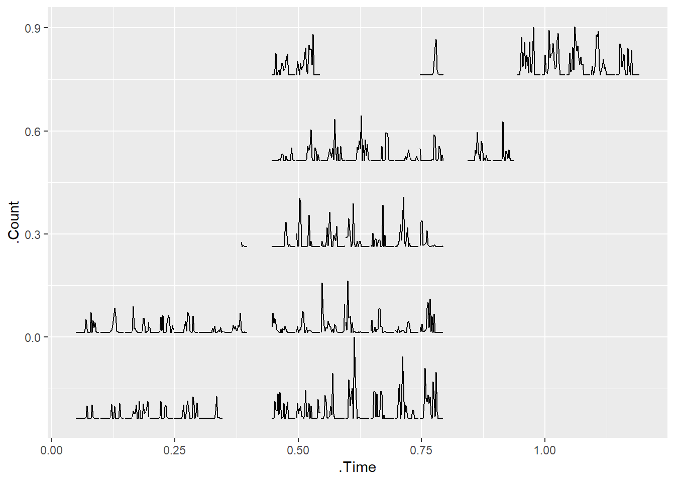
The initial plot sort of resembles a calendar. However, we can make it look much more calendar like with the use of the prettify function, and voila! A calendar plot!
prettify(p, label.padding = unit(0.08, "lines"))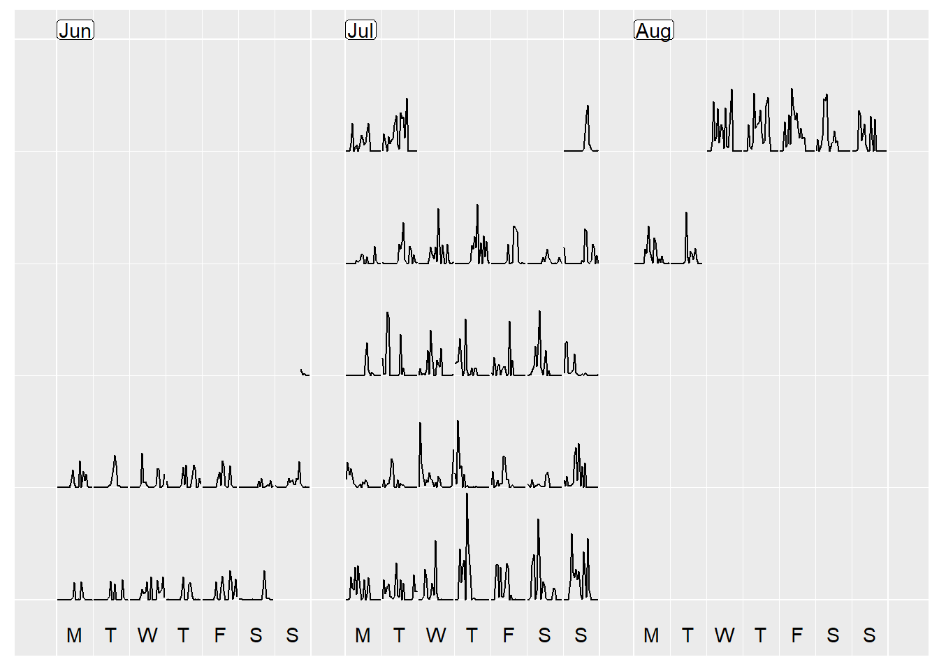
4) A slight nuisance - time zones!
If you look closely, even though you can see the general pattern that whilst I am away (9th July to 6th Aug) I am more active than the preceding weeks, the timing of my steps is all off due to me hopping around different time zones, and the data when exported being set to Sydney (GMT + 10) time! Oh dear!
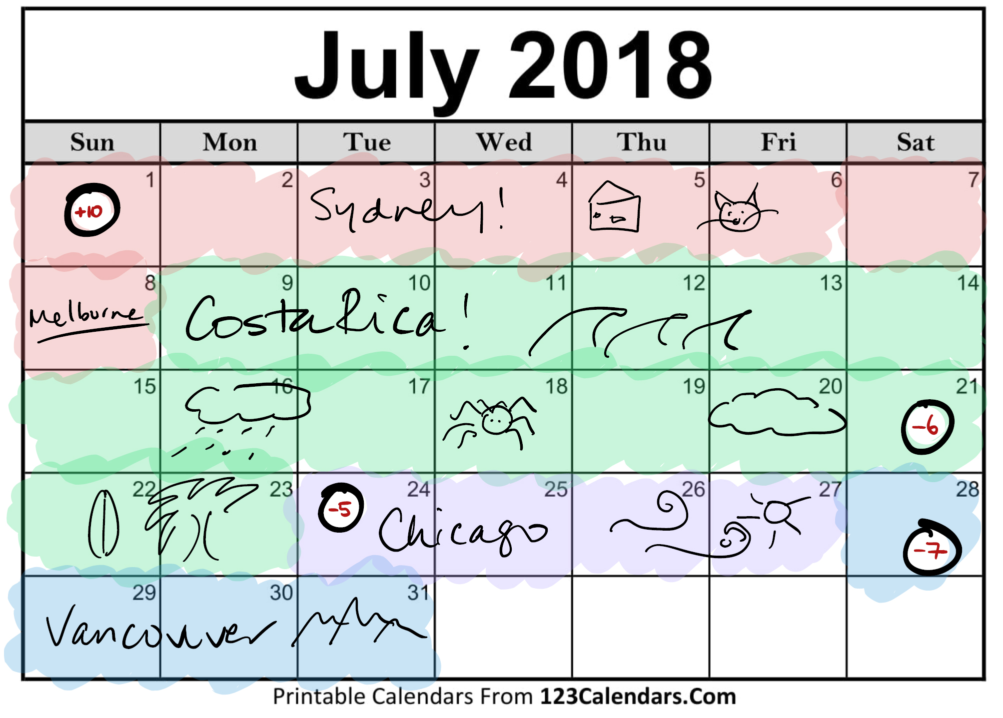
Although I visited many different timezones at different times of the day (eg, on 24th July I went from GMT -6, to -4, to -5), I decided for days that I was in multiple time zones to pick one that described the day the best. For the month of July, I decided on the following, with a similar concept for August as well.
So how do I account for this?
I decided I would shift my whole data set from key travel dates forward and back all at once, and then for subsequent travel dates I would keep on shifting forwards and back until all dates had been accounted for. I won’t put in all the R code, but I include the code I used to make the first shift to the time zone in Costa Rica (-16 hrs from Sydney). Dates that overlapped with Sydney after being shifted back were deleted so that the steps in Sydney time would be plotted, with Costa Rica steps starting at midnight on 9th July.
# First shift - all data post 9 July to CR time zone, -16hrs #

inds_shift <- which(data$Date >= as.Date("2018-07-09"))
data_shift <- data %>% filter(Date >= as.Date("2018-07-09"))

data_shift <- mutate_at(data_shift, vars(Finish), funs(.-hours(x=16)))
data_shift <- mutate(data_shift, Date=date(Finish))
data_shift <- mutate(data_shift, Time=hour(Finish))
head(data_shift)
## Finish Count Time Date
## 1 2018-07-08 08:00:00 0 8 2018-07-08
## 2 2018-07-08 09:00:00 0 9 2018-07-08
## 3 2018-07-08 10:00:00 0 10 2018-07-08
## 4 2018-07-08 11:00:00 0 11 2018-07-08
## 5 2018-07-08 12:00:00 0 12 2018-07-08
## 6 2018-07-08 13:00:00 0 13 2018-07-08del <- which(data_shift$Date==as.Date("2018-07-09"))
inds_shift <- inds_shift[-del]
data[inds_shift,] <- data_shift[-del,]Implementing these shifts, we have a more reasonable looking calendar plot. Woohoo!
data_cal <- data %>% frame_calendar(
  x = Time, y = Count, date = Date, calendar = "monthly"
)

p <- data_cal %>%
  ggplot(aes(x = .Time, y = .Count, group = Date)) +
  geom_line() +
  theme(legend.position = "bottom")
prettify(p, label.padding = unit(0.08, "lines"))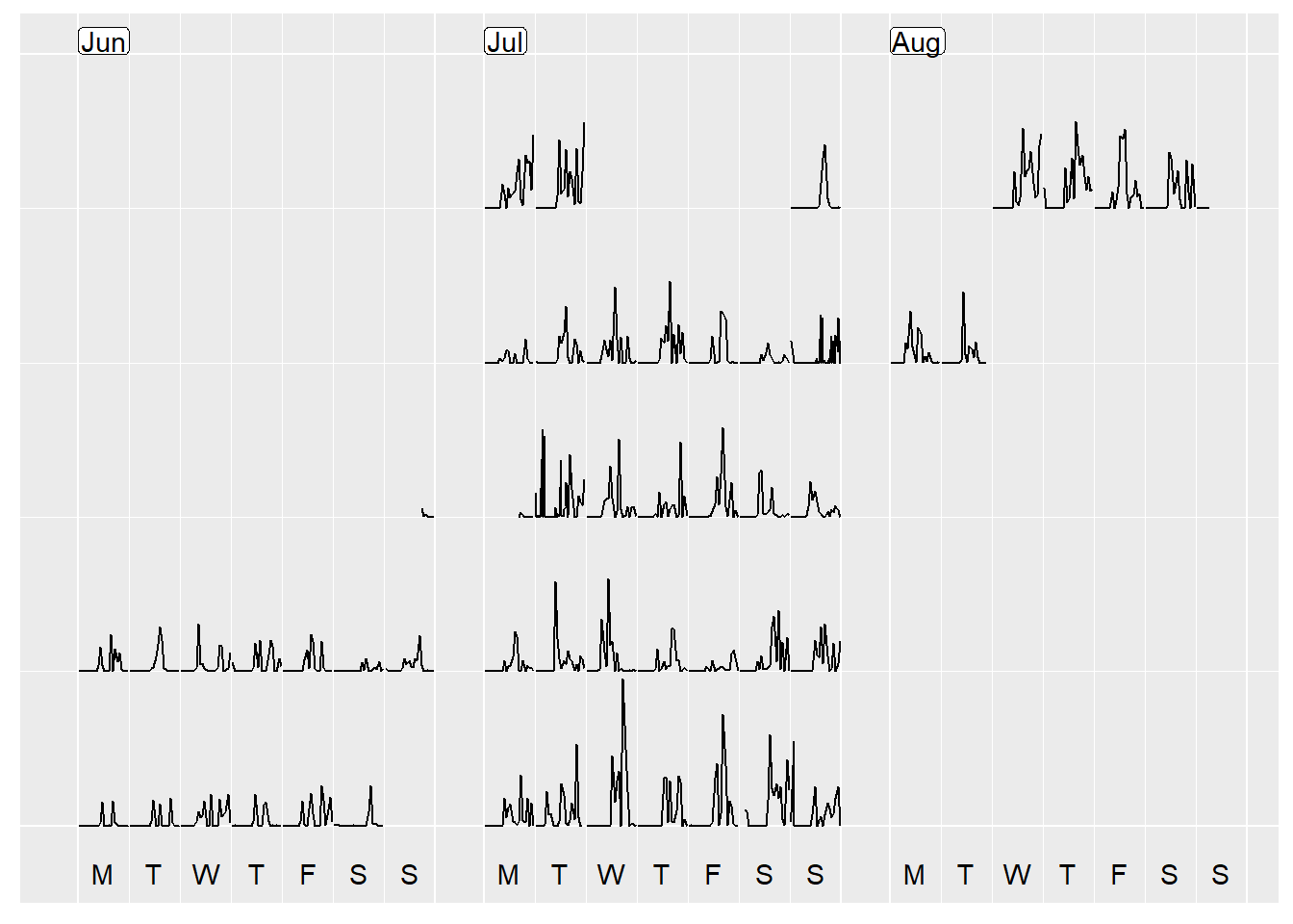
5) Add in some colour!
The last step I did was to colour the dates by what area/timezone I was in, by adding in a column called Region which I used in the plotting step to add a colour element. I also cleaned up and removed data from the 5th of August - I left SFO at 11pm on 4th August local time and arrived 6.30am in Sydney on 6th August - so data on that day did not make sense in either timezone.
p <- data_cal %>%
  ggplot(aes(x = .Time, y = .Count, group = Date, colour=Region)) +
  geom_line() +
  theme(legend.position = "bottom")
prettify(p, label.padding = unit(0.08, "lines"))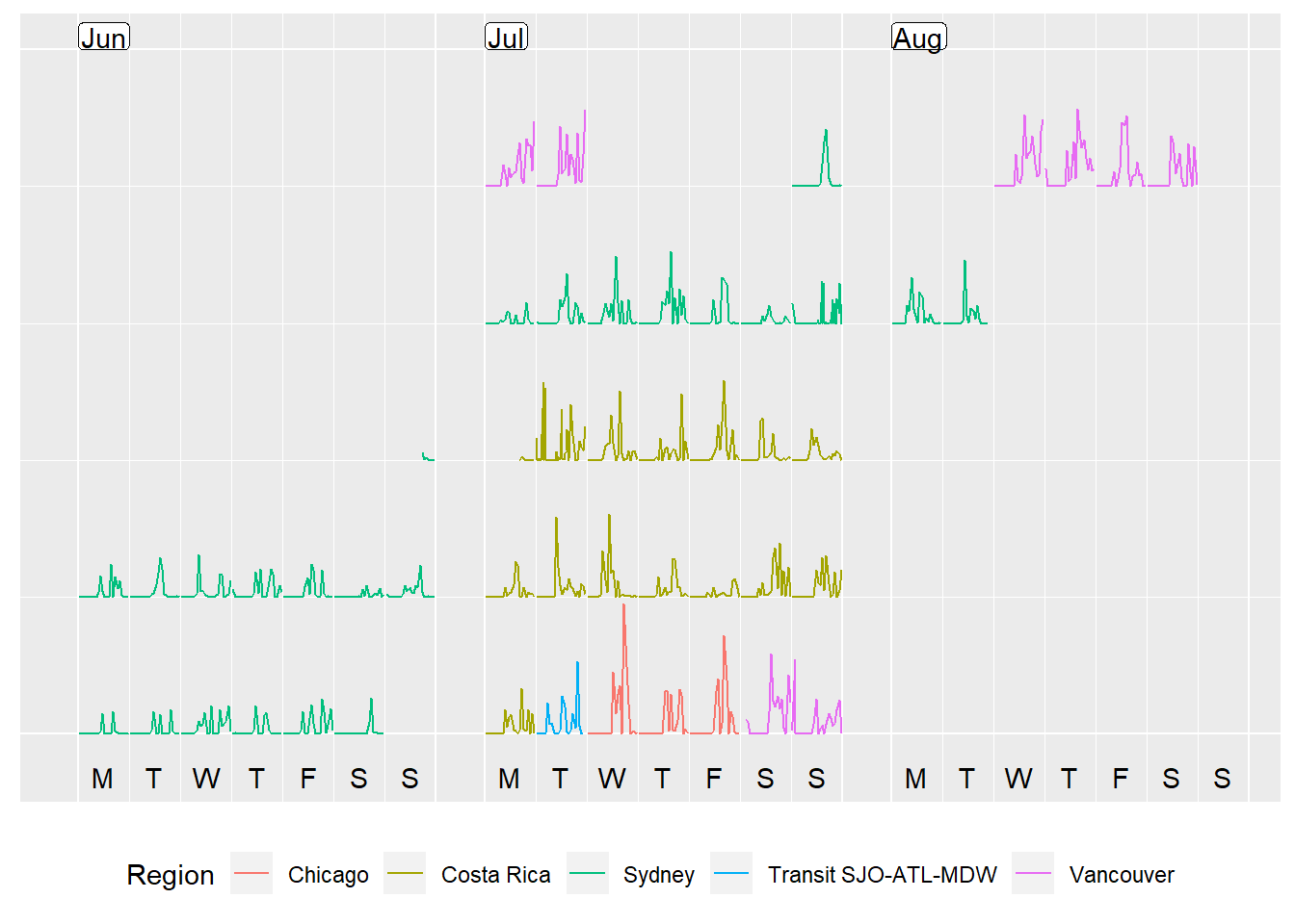
What do you think? My steps definitely went up when I was away! Can you spot the time when I walked 8km in 30 degree heat from Wicker Park to downtown in Chicago? Or the day where it rained in Tortuguero all day in Costa Rica and the only walking I did was to see the turtle laying eggs at 8pm?
6) An alternative view - a cumulative step plot!
I also thought I would try a cumulative sum step plot. Using a for loop, yes, a loop (I know some people will already dismiss me at this point, but I love for loops - sue me!), I calculate the cumulative sum over entries that share the same date.
data <- data %>% mutate(Cumulative_Count=Count)
for(i in 1:nrow(data)){
  if(i == 1){
    data$Cumulative_Count[i]=data$Count[i]
  }else if(data$Date[i]!=data$Date[i-1]){
    data$Cumulative_Count[i]=data$Count[i]
  }else{
    data$Cumulative_Count[i]=data$Count[i]+data$Cumulative_Count[i-1]
  }
}

head(data)
## Finish Count Time Date Region Cumulative_Count
## 1 2018-06-17 17:00:00 347.00000 17 2018-06-17 Sydney 347.0000
## 2 2018-06-17 18:00:00 22.00000 18 2018-06-17 Sydney 369.0000
## 3 2018-06-17 19:00:00 114.17046 19 2018-06-17 Sydney 483.1705
## 4 2018-06-17 20:00:00 20.82954 20 2018-06-17 Sydney 504.0000
## 5 2018-06-17 21:00:00 0.00000 21 2018-06-17 Sydney 504.0000
## 6 2018-06-17 22:00:00 0.00000 22 2018-06-17 Sydney 504.0000data_cal <- data %>% frame_calendar(
x = Time, y = Cumulative_Count, date = Date, calendar = "monthly"
)
p <- data_cal %>%
ggplot(aes(x = .Time, y = .Cumulative_Count, group = Date, colour=Region)) +
geom_line() +
theme(legend.position = "bottom")
prettify(p, label.padding = unit(0.08, "lines"))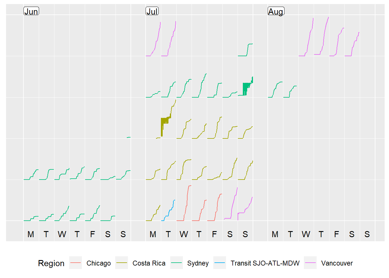
Something looks pretty funny around the transition between Costa Rica and Sydney time zones. Most likely I’ve made some errors when accounting for the two timezones. However, that shall be a post for another day! Right now, time for some tea… and pizza
Take home message - eat that pizza when travelling - you’ll be back to a sloth when at home!