Have you ever had one of those moments whilst teaching where the content blows your mind? Today, whilst teaching MATH1005 at the University of Sydney, that exact thing happened to me.
This weeks content was focused on teaching the students the introductions to linear modelling. A very strightforward topic, and one ususally understood well by first years. However, a twist in our teaching style left me with such an appreciation for the simpler explanations in statistics.
Linear modelling - through calculus
Throwing back to 6 years ago when I was a first year, and even back to a year ago when I first taught this course, linear regression was taught in a very standard way.
If I have some continuous bivariate data, and the relationship between the two variables looks linear upon inspection, how can one fit a line which is ‘optimal’? The standard way of answering this question is to treat the problem as a mathematical one, using calculus to find the slope and intercept that minimise the sum of squares between the fitted line and the observed responses. See here for one of the many examples of this on StackExchange.
This usually is very easy to understand by first years, and seemed the simplest possible way of explanation I could concieve. But then came along another explanation…
The SD Line
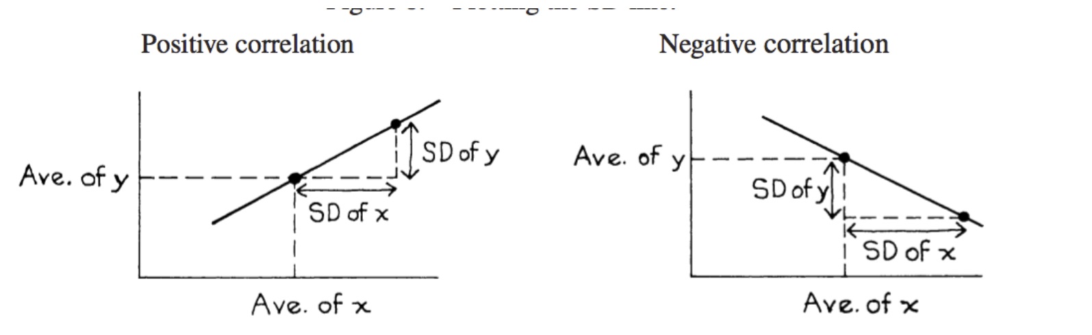
Imagine you are trying to find the best line to fit the data, without any knowledge of calculus. How do you do it? An intuitive way might be to connect the point of averages \((\bar{x}, \bar{y})\) to \((\bar{x} + \text{SD}_x, \bar{y} + \text{SD}_y)\). This is described in detail by Freedman, Pisani, and Purves in their book, Statistics.
Applying this to simulated data, we can visualise the SD line as follows:
library(ggplot2)
library(dplyr)
library(magrittr)
gen.y <- function(x, rho) {
y <- rnorm(length(x))
x.perp <- residuals(lm(y ~ x))
rho * sd(x.perp) * x + x.perp * sd(x) * sqrt(1 - rho^2)
}x <- 1:50
y <- gen.y(x, 0.5)
dat <- data.frame(x=x, y=y)
p.sd <- ggplot(dat %>% mutate(slope.sd=sd(y)/sd(x),
icept.sd= mean(y)- (sd(y)/sd(x))*mean(x)),
aes(x, y)) +
geom_point() +
geom_abline(aes(intercept=icept.sd, slope=slope.sd), col="red")+
geom_vline(xintercept = mean(x)+sd(x))+
geom_vline(xintercept = mean(x)-sd(x))+
geom_point(aes(x=mean(x), y=mean(y)), colour="dodgerblue", size=5)+
ggtitle("SD Line for simulated linear data with r = 0.5")
p.sd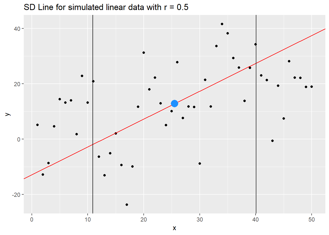
We have highlighted the point of averages \((\bar{x}, \bar{y})\), and 1 SD on either side of this point. We can see the SD line does a pretty decent job of describing the linear relationship! But alas! Let’s look closely at the extremes. Towards the RHS, the SD line overestimates the y response, and towards the LHS, it underestimates the values. How can we fix this?
A fix? The regression
The regression line is very similar to the SD line, with a slight change in how it is defined. The regression line is defined as the line connecting \((\bar{x}, \bar{y})\) to \((\bar{x} + \text{SD}_x, \bar{y} + r\text{SD}_y)\). See the change? We have incorporated information about how the points cluster around the line. As \(r\) is in magnitude between \(0\) and \(1\), the only effect it can possbly have is to dampen the gradient! As such, this will push our line down towards the positive extreme, and push the line up towards the negative extreme.
You can show that the equation of this line matches that derived by least squares estimation! Hoorah! How amazing is that???! Or is that only me…
See the effect on our simulated data below, taking advantage of the geom_smooth() function in ggplot2.
p.r <- p.sd + geom_smooth(method='lm',formula=y~x) + ggtitle("SD and Regression lines for simulated data, r=0.5")
p.r
We can compare the two lines as follows

And you can experiment with an app online by Berkeley here.
gganimate - a success!
A cool feature about the regression line is that as \(r \rightarrow \pm 1\), it approaches the SD line! So I thought I would devise my first gganimate plot highlighting this. Feedback regarding the code is much appreciated!
If you don’t have gganimate, you can download from here. Note, this is an updated version not on CRAN.
# install.packages('devtools')
devtools::install_github('thomasp85/gganimate')library(gganimate)First, I set up the plot without the animation layers. It looks like a bit of a mess with out the frames! The red line is the SD line, and the blue lines are the regression lines.
x <- 0:50
r <- seq(0, 1, by=0.05)

y.vals <- unlist(purrr::map(r, ~gen.y(x, .)))
x.vals <- rep(x, length(r))
r.vals <- rep(r, each=length(x))


data <- data.frame(x.vals=x.vals, y.vals=y.vals, r.vals=r.vals)
head(data)
## x.vals y.vals r.vals
## 1 0 -17.071776 0
## 2 1 7.112183 0
## 3 2 10.129332 0
## 4 3 -25.638644 0
## 5 4 26.779453 0
## 6 5 7.190922 0p.set <- ggplot( data %>% group_by(r.vals) %>% mutate(slope.sd=sd(y.vals)/sd(x.vals),
icept.sd= mean(y.vals)- (sd(y.vals)/sd(x.vals))*mean(x.vals),
slope.r=r.vals*sd(y.vals)/sd(x.vals),
icept.r= mean(y.vals)- (r.vals*sd(y.vals)/sd(x.vals))*mean(x.vals))
, aes(x.vals, y.vals)) +
geom_point() +
geom_abline(aes(intercept=icept.sd, slope=slope.sd), col="red") +
geom_abline(aes(intercept=icept.r, slope=slope.r), col="blue")
p.set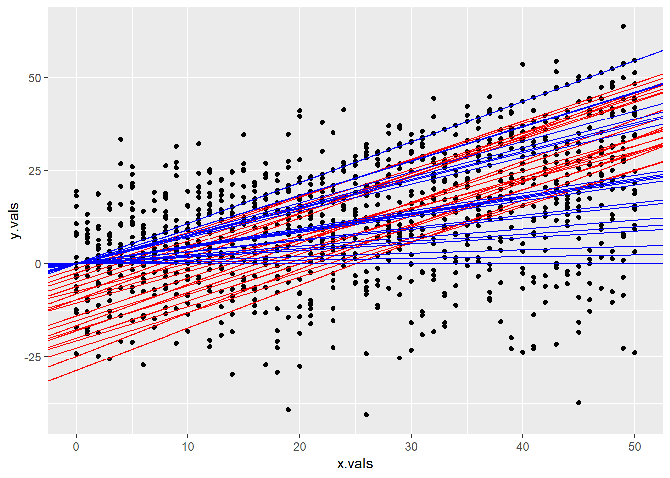
Now, we add in the animation layers. And voila! We have an animation!
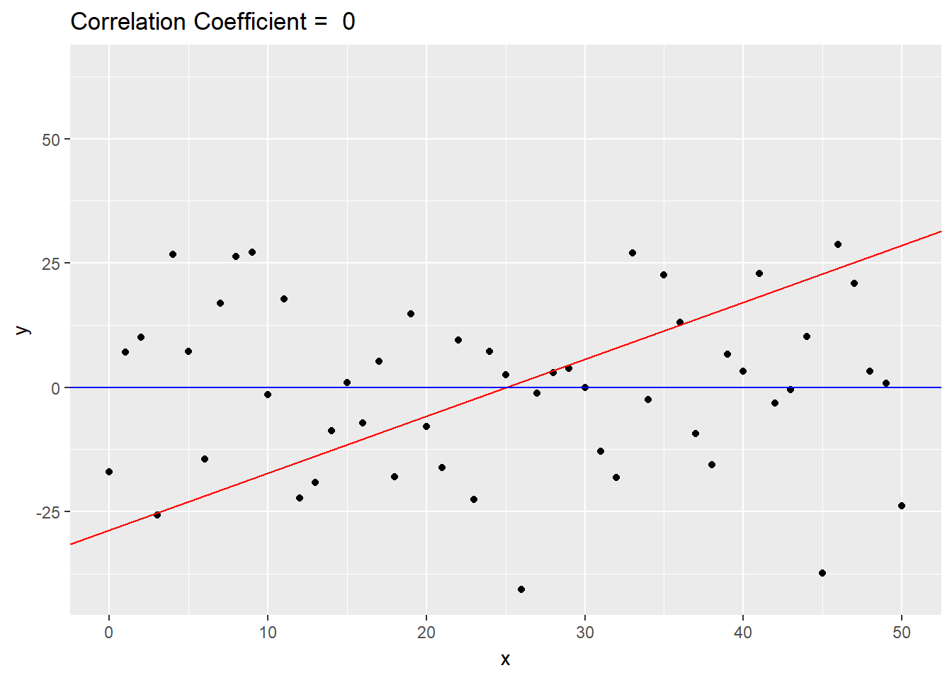
p.ani  <- p.set + labs(title = 'Correlation Coefficient =  {round(frame_time, 2)}', x = 'x', y = 'y') +
  transition_time(r.vals) +
  ease_aes('linear')

p.ani